To establish a consistent brand visualization in all areas of our corporate communication, we have developed general brand guidelines that define the use of logo, colors and typography.
By sharing the ATHENS FITNESS FESTIVAL (AFF) brand guidelines, we would like to familiarize you with the AFF logo and to ensure that is consistently applied throughout all electronic and printed material.
The application of the points listed below is obligatory for every user. Changes made by the user himself will not be accepted.
Should you require further information or approval please contact us at: info@awff.gr.
In continuous texts, the name ATHENS FITNESS FESTIVAL is not displayed as the company logo, but in the respective typeface exclusively in capitals.
If the logo is to be displayed negatively, only the white version may be used on dark background. The logo is not to be colored in other colors.
For appropriate purposes, the figurative mark can be used alone and in the following variations.


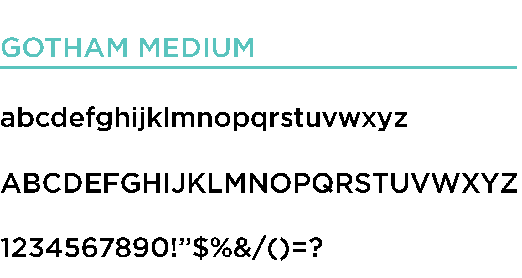
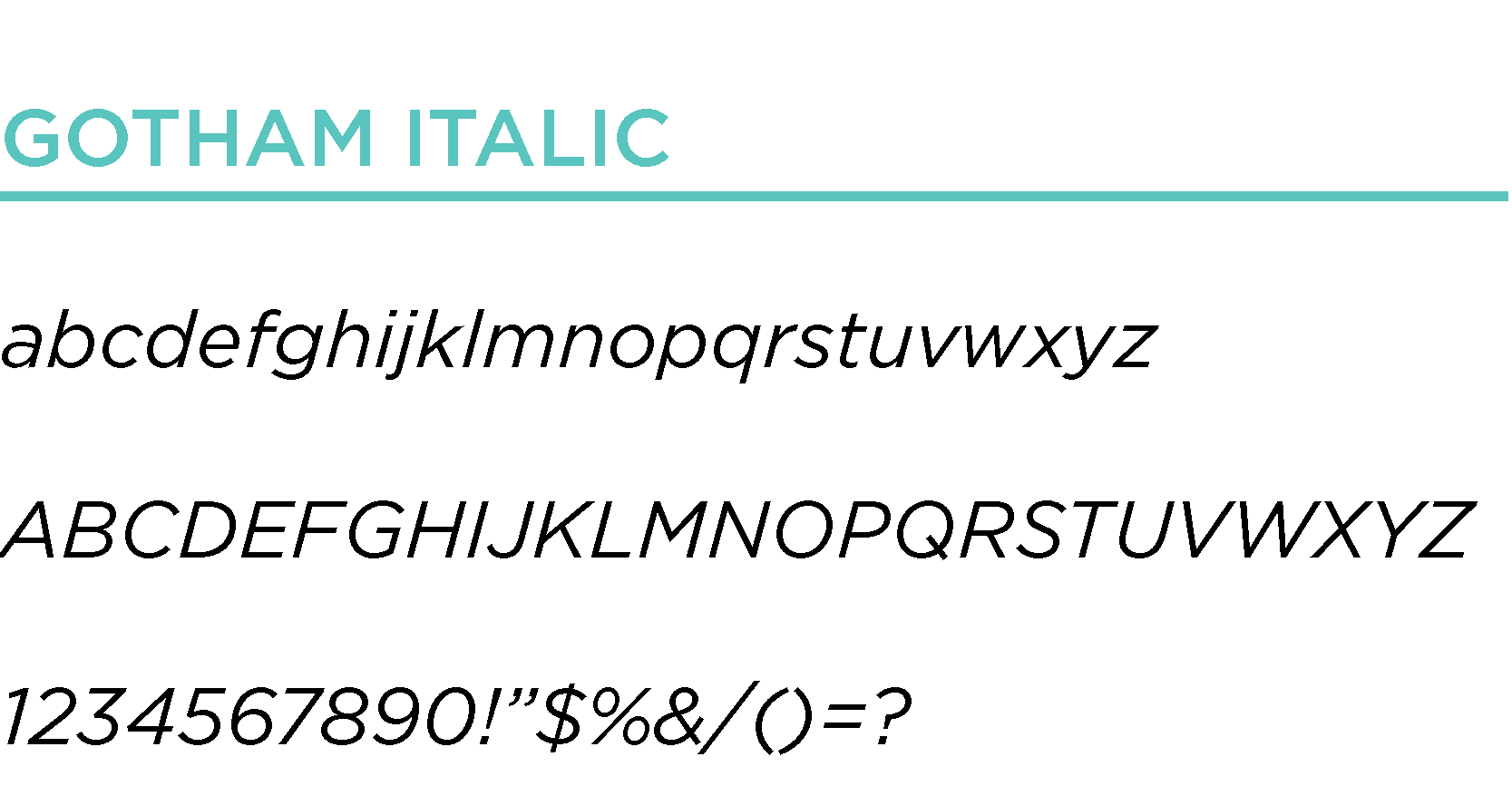
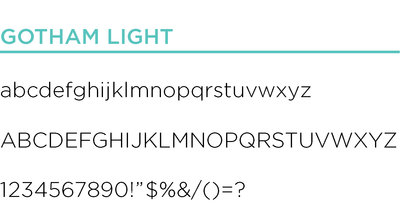
AFF’s base font is the Gotham font family. Gotham font is a geometric sans-serif typeface family and were inspired by examples of architectural signs of the mid-twentieth century.
RBG 91 | 195 | 190
CMYK 60% | 0% | 30% | 0%
PMS 3255 C
RBG 155 | 183 | 223
CMYK 37% | 20% | 0% | 0%
PMS 2128 C
RBG 28 | 25 | 78
CMYK 100% | 98% | 30% | 40%
PMS 274 C